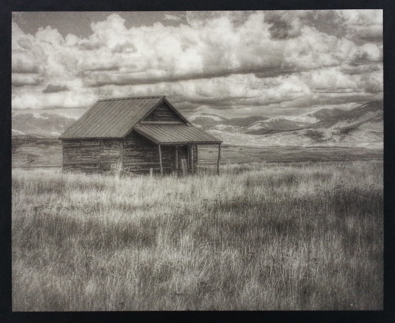
This page will document my progress in learning a new method of creating photographic prints: the Rawlins Oil Pigment Process. My intention here is simply to document my successes (and failures) for my own use. However, I hope others will find this page useful.
It all began last month when I was invited to spend the better part of a week working with Richard Sullivan of Bostick-Sullivan.com. We began with some carbon printing, then progressed to rod-coating tests and finally oil printing. I’d heard of the Bromoil process, but I must confess I had never read of Mr. Rawlins or his oil pigment process before that week. In the two weeks since that trip to Santa Fe, I have collected several books on oil processes, watched every YouTube video I could find, and have begun ‘tooling up’ for my own excursion into this most interesting, and creative, turn-of-the-century technique.
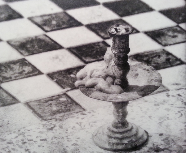
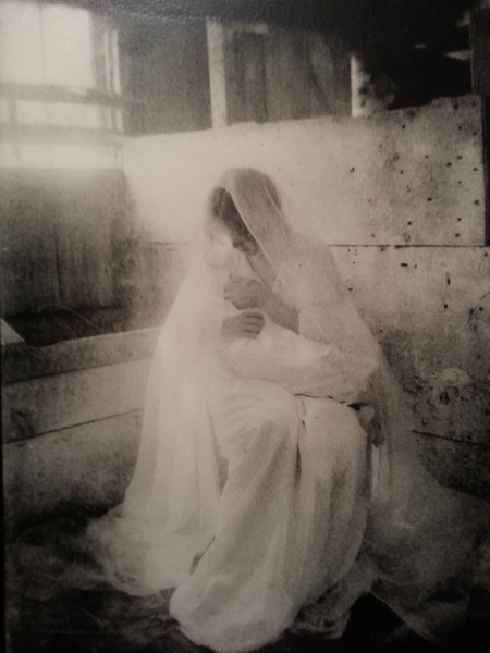
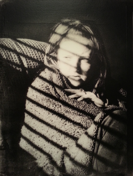
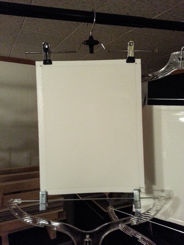
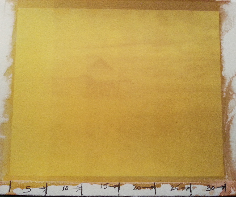
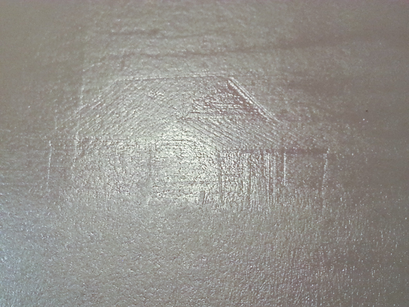
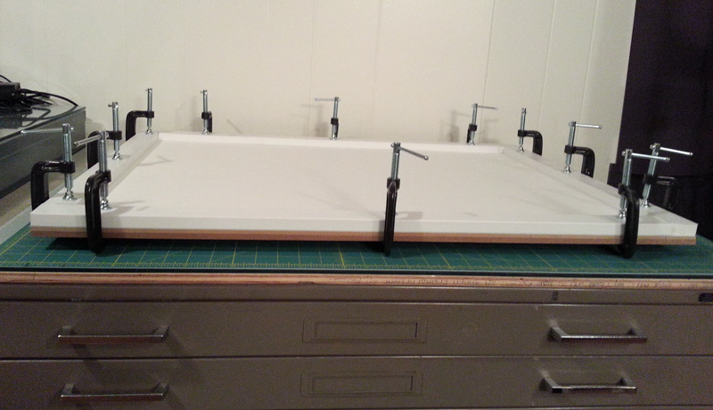
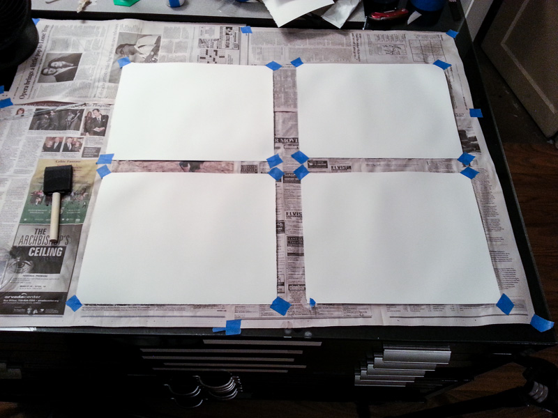
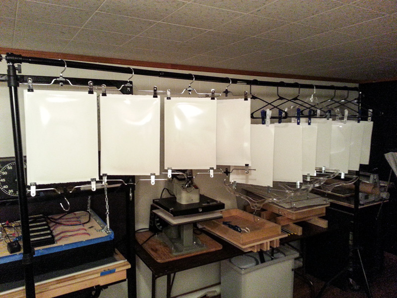
In a nut shell, You begin with a sheet of watercolor paper, coat it with a layer of clear gelatin, contact expose it to UV light, soak the paper then brush or roll on a heavy oil-based, pigmented ink. Sounds simple, right? Well, since my approach in learning something new is to usually over-research and over-think the data, It could take a while to before the first successful print.
Here are some links to contemporary masters and workers of the craft. They will include both oil and bromoil techniques because the two result in a similar outcome: a photographic print made with hand-applied pigmented oil inks. I will return to this post and add more links as I find them. Note: each link will open in a new page.
Oil Printing:
Oleotype The process from start to finish.
Frantisek Strouhal Canadian oil printer
The Oil Print Process by Ed Buffaloe
A Method for Making Oil Pigment Prints by Ernest Theisen
Robert Pawlowski Check out his color prints! I really like the Sunflowers.
Bromoil:
Norman Gryspeerdt A Six-part video interview of a true master.
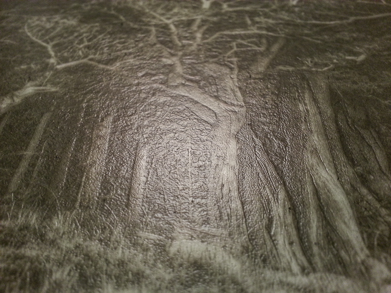
Constance Asseman Making an amazing forest print.
Joy Goldkind
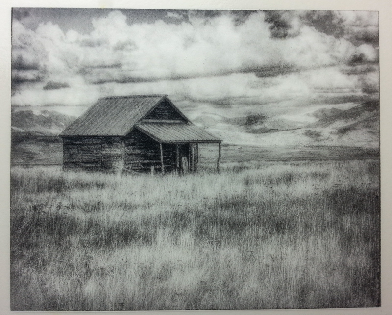
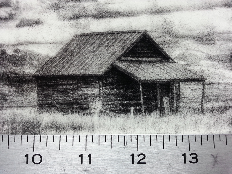
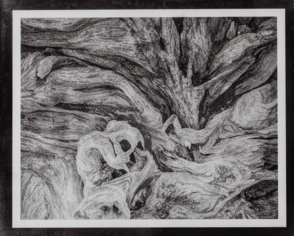 The neg color was 130-100-60 on the HSB scale.
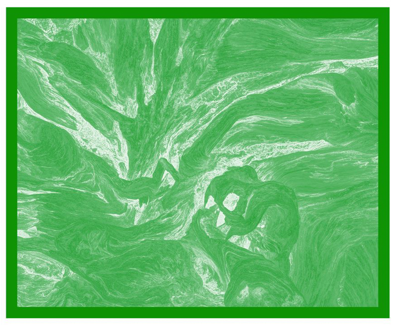 And here is a screen shot of the Photoshop adjustment curve used to linearize the mid-tones.
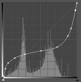 There is a lot of work still to be done in fine tuning all of the techniques.